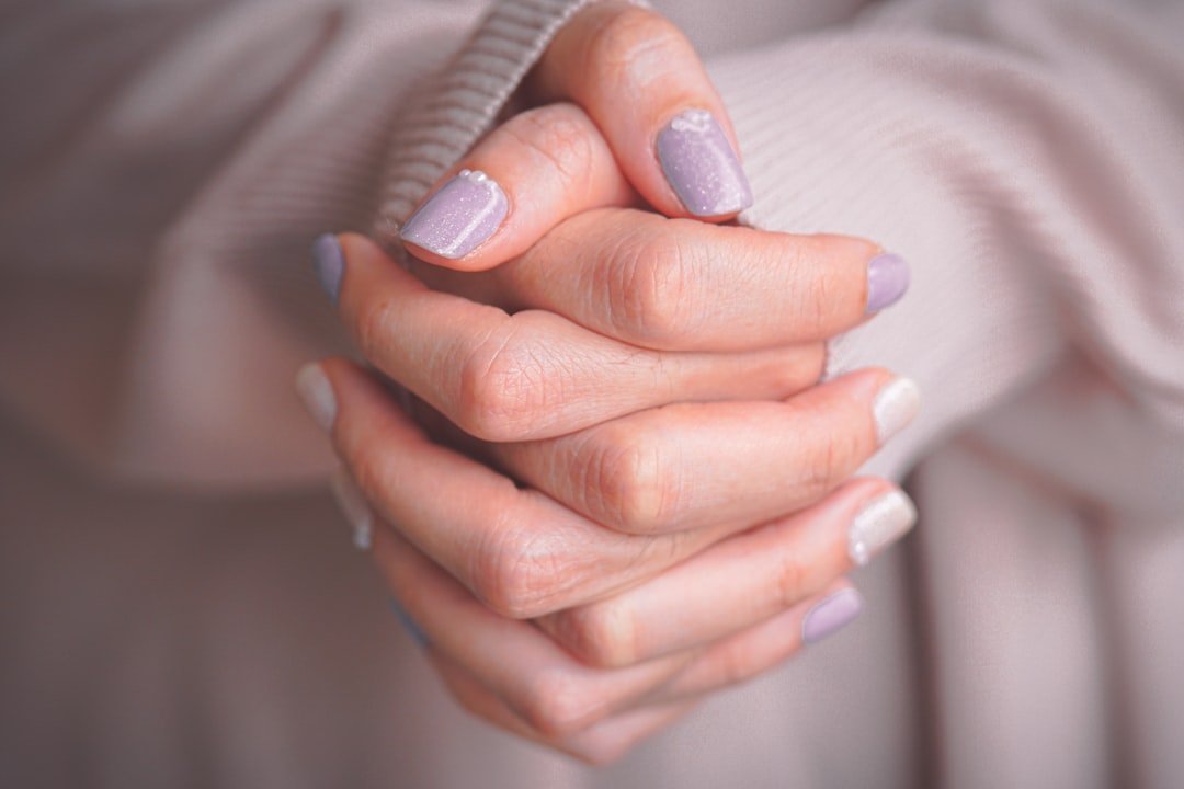
A nude manicure is often described as the easy option, but finding the right nude can take more testing than choosing red. Very opaque beige can flatten the nail, while a shade that matches the skin too closely can make the hands look washed out.
The useful goal is usually harmony, not exact skin matching.
Decide how much contrast you want
A slightly pink nude gives the nail a healthy-looking separation from the skin. Beige looks quieter. Caramel and tan nudes create more depth on medium and deep skin tones without trying to disappear.
Try the shade beside the cuticle. That is where the relationship with your skin is easiest to judge.
Sheer is more forgiving than opaque
One or two translucent coats allow the natural nail to contribute color, which helps a nude look less chalky. Highly pigmented cream formulas can be beautiful, but the undertone needs to be closer to what you want.
If you are between shades, a sheer formula often looks more natural than forcing an opaque near-match.
Shape keeps a simple manicure intentional
Because there is no strong art or color to distract the eye, the perimeter and cuticle work become more visible. Round, squoval, oval and almond all suit nude polish when the shape is consistent.
Use the nail shapes guide to compare what each shape does visually.
Add detail only if the base still feels too flat
A micro French edge, tiny dot or soft chrome veil can give the nude more dimension. Keep the detail proportional to the nail length so the manicure still reads as clean.
The best nude is not the one that disappears completely. It is the one that makes the hands look finished without making the polish itself feel heavy.
Use your natural nail color as a clue
If your bare nail plate is naturally pink, a pink-beige sheer may blend more easily than a yellow nude. If the nail is more neutral, a beige or caramel wash may look cleaner. The polish does not need to match the skin; it needs to make sense beside both skin and nail.
Opaque nude needs cleaner application
Streaks show readily in pale cream formulas. Use thin coats and let each one level before adding the next. If three coats still look patchy, a different formula may be a better choice than continuing to build thickness.
A good nude should simplify the manicure, not make application harder than nail art.
The best nude often has a little more color than expected
A polish that exactly matches the skin can disappear in a way that makes the hands look flat. A touch more pink, peach, beige or mauve often keeps the manicure neutral while still giving the nail a defined presence. Think of “nude” as a low-contrast family rather than a literal skin match.
Testing swatches beside the cuticle is more useful than comparing bottles. Skin tone, nail-plate color and indoor lighting all influence how the shade reads once applied.
Sheer nude and opaque nude create different maintenance demands
Sheer formulas hide grow-out well and are forgiving around the cuticle, but they show more of the natural nail. Opaque creams create a cleaner block of color but reveal chips and uneven application faster. Choose the finish according to how long you want the manicure to look tidy, not only according to the first-day photo.
If you prefer understated designs, our short natural nail guide offers ways to keep a minimal manicure from looking unfinished.
Use top coat to correct surface, not undertone
A glossy top coat can revive a nude that looks flat, but it will not fix a shade that is fundamentally too gray, too yellow or too pale for the effect you want. If the color still looks chalky after shine is restored, change the undertone or transparency rather than stacking more layers.
Let the nude relate to the free edge
On shorter natural nails, the white free edge can show strongly through a sheer beige. If that contrast bothers you, choose a slightly milkier formula rather than adding coat after coat. If you like the natural translucency, embrace it and keep the manicure thin. Both approaches can look polished when the choice is deliberate.
Lighting can make a nude look chalkier than it is
Cool overhead lighting can pull beige and pink nudes grayer, while warm bulbs can make the same polish look more yellow. Check a swatch near a window before deciding that the undertone is wrong.
If the manicure needs to work in an office or event space, look at it there too. The shade should still feel intentional in the lighting where you will actually see it.
Use one finger as a test before committing to ten
When two nudes look almost identical in the bottle, paint one nail with each and let both coats dry completely. Wet polish can look darker or warmer than the finished result.
A one-finger test is especially useful with sheer formulas because your natural nail changes the final color.
Regrowth can guide the opacity choice
If you dislike a visible cuticle line after several days, a sheer or semi-sheer nude is usually easier to maintain than a dense cream. If you prefer a perfectly uniform block of color, accept that the manicure may need refreshing sooner.
Choose the maintenance trade-off before the opacity, not after the first chip appears.
Use jewelry and clothing as a secondary check
If you wear mostly warm gold and camel tones, a slightly warmer nude may feel more connected to your everyday palette. If your wardrobe leans cool gray, navy or silver, a pink-beige or taupe nude may sit more naturally beside it.
This is not a rule about undertone. It is simply another way to compare two shades that both look acceptable against the skin.
Do not force a pale nude just because it is called neutral
On deeper skin, a richer caramel, cocoa or rosy brown can still function as a nude while giving the nail enough contrast to look polished. “Nude” should describe the low-key role of the color, not require the lightest beige in the range.
Featured image: Photo by Kevin kevin on Unsplash.