Negative-space nail art treats the natural nail as part of the design instead of covering every millimeter with color. That is what makes the style feel light and modern, but it also means the exposed areas need to look deliberate. Random gaps read as missed polish; clean spacing reads as design.
The cleanest negative-space designs are usually simple: one clear visual rule, clean edges and enough open nail that the empty space feels intentional.
Start with one clear shape
Half-moons, diagonal blocks, floating French tips and simple side panels are easier to read than several unrelated gaps on the same nail. Choose one rule and repeat it with small variations rather than trying to fit multiple techniques onto one short nail.
Precision matters more than complexity
Negative space creates strong contrast between painted and unpainted areas, so uneven edges are noticeable. A fine brush, striping tape or careful cleanup brush can make a basic line look more polished than a complicated design with rough borders.
If you like fine, controlled detail, our micro French tip guide uses the same principle: small-scale detail works best when line weight stays consistent.
Short nails need fewer elements
A design that looks airy on a long almond nail can feel crowded on a short round nail. On natural-length nails, one bare crescent, one diagonal gap or one floating tip may be enough.
Leaving more open nail often makes the result look cleaner, not less finished. Our short natural nail design guide has more ideas for scaling detail to the space you actually have.
Decide what “bare” should mean
You can leave the natural nail visible under a clear base coat, or use a sheer pink, beige or milky layer first. A translucent base can even out discoloration while preserving the negative-space effect.
If the natural nail tone varies from finger to finger, a sheer base often creates a more consistent finished look without losing transparency.
Growth can work in your favor
Designs that leave space near the cuticle can make regrowth less obvious because there is no solid color line moving away from the nail fold.
That makes negative-space manicures useful when you want nail art that still looks intentional after several days.
Choose where the empty space will sit before choosing color
Negative space near the cuticle creates a different effect from a central gap or a bare strip along one side. The location controls how the nail looks as it grows and how much of the natural plate remains visible.
Decide the structure first, then choose the polish color. This keeps the design from becoming a normal manicure with random gaps added afterward.
Natural nail tone affects the final contrast
A very clear base shows every variation in the nail plate, while a sheer pink or beige can create a more even background. If your nails differ noticeably in tone, a translucent base may make the negative space look more deliberate.
The base should stay sheer enough that the design still reads as open space rather than a fully covered manicure.
Short nails benefit from repeating one motif
On a small nail plate, repeating one diagonal, crescent or floating tip often looks more polished than giving each finger a completely different negative-space design.
Variation can come from line direction or color while the basic structure stays consistent.
Plan touch-ups around the painted areas only
If one painted section chips, repairing that small area may be easier than recoating the whole nail. Avoid brushing a full opaque layer over the design because that can destroy the negative-space structure.
For larger chips or uneven edges, removing and rebuilding the affected nail usually looks cleaner than stacking several corrective layers.
Use color contrast carefully
A single strong color against the natural nail creates the clearest graphic effect. Two or three colors can work, but each extra shade reduces the amount of visual breathing room.
If the design already has an unusual shape, keeping the palette simple usually makes the negative space easier to read.
Gloss versus matte changes the effect
Gloss makes the contrast between bare and painted areas sharper. Matte can soften the whole look, but it also makes surface texture more visible.
If the design uses several colors or tiny lines, a glossy top coat is usually the safer choice for keeping everything cohesive.
Think about nail shape before choosing the pattern
Diagonal gaps can visually lengthen short square nails. Curved half-moons can echo rounded or almond shapes. A floating French tip works best when there is enough free edge to make the spacing readable.
The design does not need to copy the nail shape exactly, but it should not fight it.
Common reasons negative-space nail art looks unfinished
- The gaps are different sizes without a clear reason.
- The painted edges are rough or inconsistent.
- Too many colors compete with the empty space.
- The design is scaled for long nails but squeezed onto a short nail.
- The “bare” area is uneven in tone and no sheer base was used.
A simple salon brief
Instead of saying only “negative-space nails,” describe the structure you want: “one diagonal bare section on each nail,” “a floating French tip with a sheer base,” or “a clean half-moon at the cuticle.” That gives the nail artist a clearer design rule to follow.
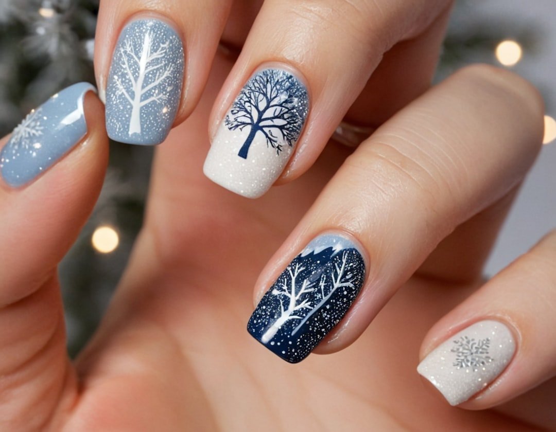
The featured image for this article is general minimal nail-art inspiration rather than an exact negative-space manicure. The defining technique described here is the intentional use of exposed or sheer nail between painted sections.
Negative-space nail art does not need to be elaborate. It reads most clearly when one visual idea, clean edges and enough unpainted nail make the empty space feel intentional rather than forgotten. Before committing to a full set, test the motif on one sample nail or tip at your real nail length. A design that looks elegant on a long reference image may need a simpler scale to stay readable on shorter natural nails. Ask the nail artist to preserve the same proportion of open space rather than copying the exact measurements from the reference photo.