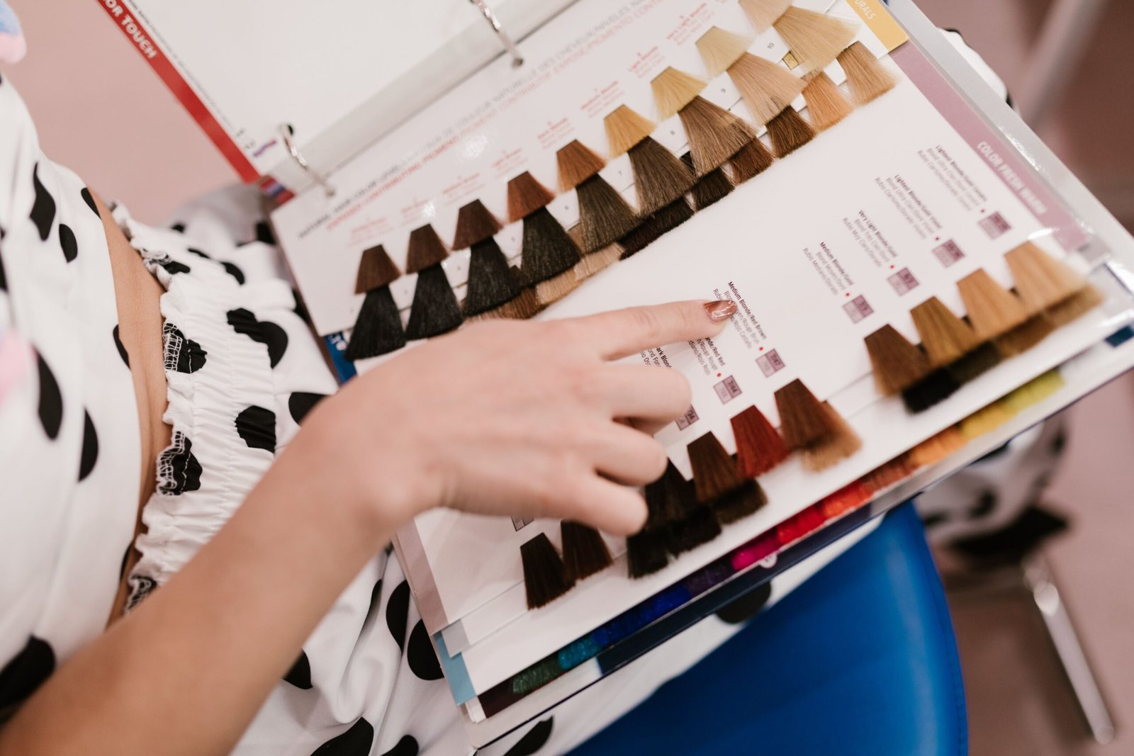
A hair-color photo can tell you what you are drawn to. It cannot tell you the exact formula that will produce the same result on your hair.
The photo may have been taken after professional styling, under warm studio light, with a camera that boosts contrast. The person in it may have started much lighter than you, had no previous permanent dye, or needed several sessions to reach the finished shade. None of that is obvious from the image.
Reference photos still belong in a good consultation. They just work better when you compare the right details.
Compare the root first
Look at how dark the root is compared with the lightest area. Is there a visible shadow at the scalp? Does the brightness begin immediately, or is there a softer transition?
This tells you far more about maintenance than the trendy name attached to the color. A bright blonde with a natural-looking root can grow out very differently from an equally bright blonde that begins uniformly at the scalp.
If maintenance is a major concern, compare the softer approaches in Low-Maintenance Blonde Hair Color and Low-Maintenance Brunette Hair Color.
Look for the darkest and lightest points, not one average shade
Dimensional color is usually a range, not a single tone. A brunette photo may contain a deep base, medium ribbons and a few brighter pieces around the face. A blonde photo may still carry substantial darker depth underneath.
Ask yourself whether you like the overall color because it is light, because it has contrast, or because the bright pieces are concentrated in certain places. Those are different requests.
Lighting can change the color more than you expect
Warm indoor light can make beige or neutral blonde look golden. Cool daylight can make the same hair appear ashier. Direct sun can make face-framing pieces look much brighter than they do indoors.
If you save a color because you love the tone, look for another photo of a similar shade in different lighting. One image alone can make you chase a tone that only exists under a specific camera and light setup.
Your starting shade changes the route
Two people can ask for the same finished color and need completely different plans. Natural medium-brown hair, permanently dyed dark hair and previously highlighted hair may all require different steps to reach a similar visual result.
That is why StyleVeya’s hair-color decision guide starts with current shade, previous color and maintenance before undertone. The target matters, but the starting point decides how realistic the route is.
Previous dye may be the invisible part of the photo comparison
Artificial pigment does not behave like untouched natural hair. If your lengths contain permanent dye, repeated box color, henna or older lightening, tell the colorist even when the current shade looks even.
Trying to force a dramatic lightening result in one appointment can increase stress on already processed hair. The American Academy of Dermatology notes that chemical coloring and lightening can leave hair dry and brittle, and its hair-coloring guidance recommends taking steps to limit damage.
Placement often matters more than the shade name
When you look at a balayage or highlighted photo, notice where the brightness lives. Is it concentrated at the face, through the ends, evenly around the head, or only in a few ribbons?
If what you like is the placement, say that. The Hair Highlights Guide can help you separate placement ideas from the broader color family before you book.
Hair texture changes how dimension appears
Waves and curls create natural light and shadow, so the same color placement can look more broken-up and dimensional than it does on very straight hair. Straight hair often shows lines, bands and transitions more clearly.
That does not mean one texture is better for highlights or balayage. It means the placement should be designed around how the hair is normally worn.
Do not judge tone without considering condition
Very bright ends can look impressive in a photograph, but if your own ends are already fragile, pushing them lighter may not be the best trade-off. A slightly deeper shade on healthier-looking hair can read more polished than a dramatic color on compromised lengths.
A good consultation should include what your hair can comfortably support now, not only what is theoretically possible.
What to say when you show the photo
Try to point to specific features:
- “I like how natural the root looks.”
- “I want the brightest pieces around the face, not everywhere.”
- “I like the warm beige tone, but I do not need to be this light.”
- “I like the contrast between the darker base and lighter ends.”
- “I want a grow-out that can go longer between appointments.”
That makes the photo a communication tool rather than a promise of an exact copy.
Skin tone is part of the picture, but it is not a formula
It is easy to assume that a color looks good because it matches the model’s skin tone exactly. In reality, makeup, clothing and the background can change the whole impression. Hair color also contains several tones at once when there is dimension.
Instead of chasing someone else’s exact “warm” or “cool” result, decide whether you want the finished color to feel softer, brighter, richer or more neutral around your face. That language leaves room for the colorist to adapt the tone to your starting hair.
White balance can make neutral hair look warmer or cooler
Phones and cameras automatically adjust color. A beige wall, bright window or warm salon light can shift the white balance enough to make a neutral blonde look golden or an ash brunette look warmer than it is in person.
When color tone is the part you care about most, save more than one example and look for images taken in ordinary daylight as well as salon lighting. Consistency across several photos is more useful than one perfect image.
Bring one photo you like and one photo you do not
A “no” photo can be surprisingly useful. If two blondes look similar but one feels too stripy, too warm or too bright at the root, showing both makes your preference clearer than a long list of shade names.
Contrast helps the consultation move from “I want blonde” to “I want softer placement, a deeper root and less brightness through the back.” That is the level of detail a stylist can actually work with.
Frequently asked questions
Why does my hair color look different in photos?
Lighting, camera processing, background colors and styling can all shift how warm, cool, dark or bright the hair appears.
Can a colorist copy a hair-color photo exactly?
They can use it as a target, but the final result depends on your starting depth, color history, condition and how your hair responds during the service.
What should I compare in a hair-color reference?
Root depth, contrast, placement of brightness, warmth or coolness, and how much of the hair is actually lightened are more useful than the shade name alone.